
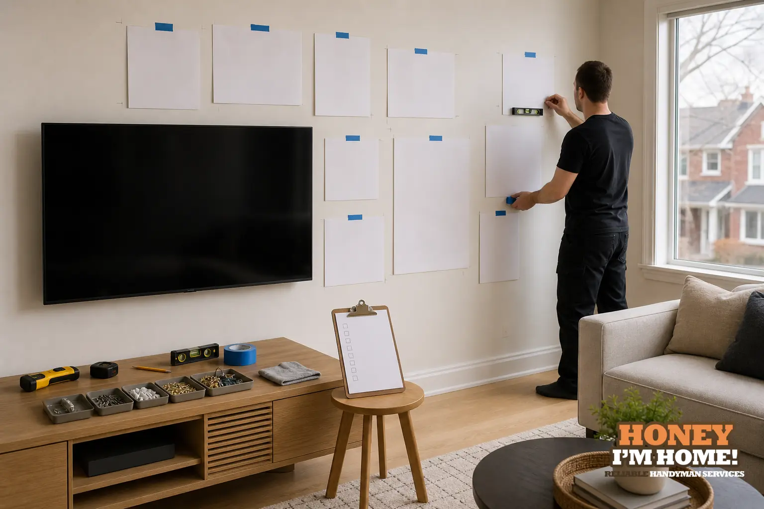
Start by choosing the anchor piece and confirming the sightline from the room’s main vantage point, then lay everything out on the floor and trace templates for the wall. I test the group visually and photograph the mockup, confirm hanger types and wall finish, and only then move from tape to drill to avoid needless patching.
Pick the anchor and set the sightline
The first thing I ask is: which frame should hold the eye? That anchor—usually the largest or most important piece—sets the scale and the implied centre of the cluster. Once I know the anchor, I check sightlines from where people will sit or pass most often. That determines the vertical and horizontal relationships for the whole arrangement.
I work with the furniture rather than measuring to opposite walls. If a sofa, console or hall runner sits under the gallery, I set the anchor so the group reads connected to that furniture. This keeps the whole installation feeling intentional and prevents a gallery that looks like it’s floating away from the room.
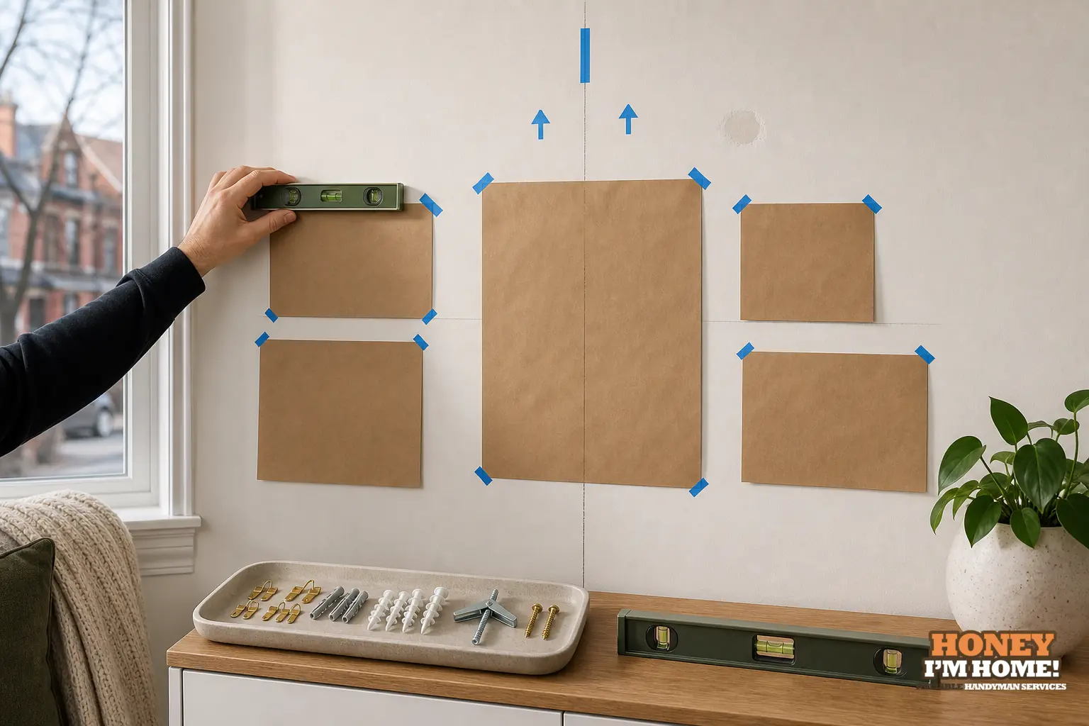
Lay everything out: floor mockups, traced templates and photos
On-site I lay frames face-up on the floor and try multiple compositions. I group similar sizes, test a few focal points and shuffle pieces until the cluster reads as one unit. When the arrangement feels right I trace each frame on kraft or butcher paper and cut templates. These templates are the single best way to preview scale and spacing without committing to holes.
I stick those paper templates to the wall with painter’s tape and step back to view from the main vantage point. I also photograph the mockup to check balance in a flattened view; photos reveal issues the eye can miss. If something looks off in the photo I tweak the layout on the wall: nudge a portrait left, lower a landscape a touch, or separate a busy frame so it breathes. Repeat until the cluster reads balanced in person and in images.
Spacing, visual weight and how to balance without measuring
Talk of spacing often drifts into numbers, but I describe it as relationship. Keep spacing consistent within a sub-cluster so the eye moves predictably; allow slightly larger gaps between sub-groups to give bigger pieces room to breathe. Consistency inside the cluster and subtle variation between groups creates rhythm.
Visual weight comes from frame thickness, mat tones and the density of the artwork. Dark, thick frames pull the eye while thin, pale frames recede. I distribute heavier-looking frames across the layout so the mass doesn’t build up on one side. A quick test: step back and squint or view the mockup photo—imbalance shows immediately and is easy to fix by swapping or nudging pieces.
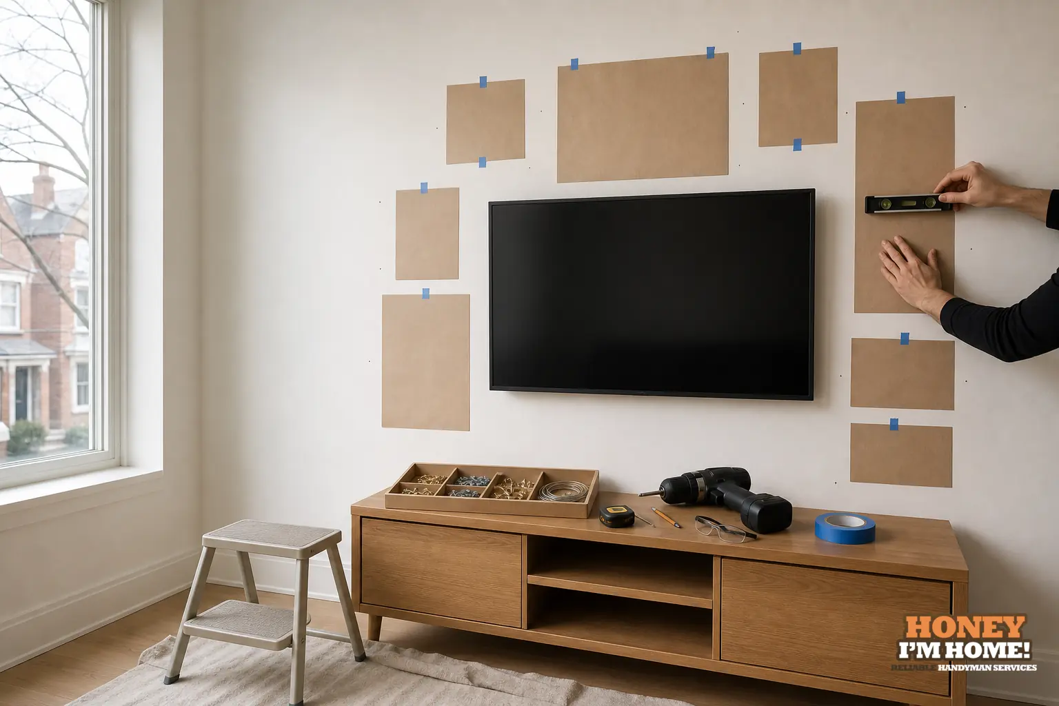
Match hangers to wall anchors: my pre-drill checklist
Before anyone reaches for a drill I check each frame’s hanger type: wire, D-rings, sawtooth hangers or a fixed bracket. Each back-of-frame hanger calls for a different anchor or hook. For wired frames I pull the wire taut and note the effective hanging point so the template shows where the top of the frame will actually sit once hung.
I also inspect the wall finish at mockup locations. Different finishes need different approaches; if a wall looks uneven, delicate, or finished with original trim I point that out to the homeowner and discuss options. For heavier or awkward pieces I recommend two hang points for stability and straightness. If owners prefer not to deal with anchors or want a fully concealed finish, I’ll describe mounting systems available through my parent service, TV & Shelving Mounting, and coordinate a tidy install.
Asymmetry, grids and aligning to architectural lines
For asymmetrical clusters I establish an implied axis—an invisible line the arrangement references—and build from there. For tighter grids I rely on the templates to ensure even spacing so the grid reads uniform from across the room. In both situations I check how the cluster relates to nearby features: windows, doors, mouldings and furniture.
If there’s a picture rail, sill or original trim line nearby I use that as a reference so the gallery looks intentionally related to the architecture rather than fighting it. Small adjustments to template placement usually make the difference between a composed wall and one that competes with the room’s lines.
How High Park building types change my approach
Working in High Park shapes my expectations at the planning stage. The City profile shows that fifty-five per cent of dwellings were built before 1960, and the area also includes a substantial apartment and condominium stock. That mix means wall assemblies and finishes can vary sharply from one house to the next. Knowing that, I carry two mental checklists when I arrive: one tuned for older detached homes with plaster, original trim and uneven surfaces; the other for apartments and renovated condos with gypsum board finishes and different backing options.
Because construction varies across nearby properties, I always confirm wall type at the mockup stage before selecting anchors or finalising hanger positions. In older homes I plan template placement around trim and expect irregularities; in condos I plan for thinner finishes and discuss mounting plates or additional reinforcement. That local, building-type awareness prevents surprises and helps me recommend the right fix for the wall I’m actually working on.
What I do on install day and final checks
On install day I transfer the taped mockup positions to reliable marker points and re-check the sightline from key places in the room. I verify that each hanger position on the template matches the back-of-frame hardware and confirm that the visible composition will be what we saw during mockup.
If anything about the wall finish looks uncertain when I remove the templates I pause and talk options with the homeowner: adjust the layout slightly, add redundant hang points for a large piece, or bring in full mounting support through /contactruss/. Often the cleanest result comes from getting me involved at the template stage rather than after the first hole is in the wall.
Practical owner checklist I use on every job
- Decide the anchor piece and confirm the sightline from where people live in the room.
- Lay frames on the floor and test compositions before ever touching the wall.
- Trace templates and stick them up with painter’s tape; photograph from your main vantage point.
- Check each frame’s hanger type and pick anchors that match the hanger before drilling.
- Consider building type and finish—older houses and condos behave differently—then finalise anchors.
If you’d like me to transfer a mockup to drilled anchors and leave the wall tidy, I handle that carefully and repeatably. For a secure install tailored to your walls and frames, contact me at /contactruss/ and we’ll walk the room together. I also offer secure mounting options through our parent service at /services/tv-and-shelving-mounting/.
“This is a person whose number is worth saving.” — Google reviewer. See more reviews at /#awards.
How close should gallery pieces be to each other?
Think about relationship rather than a fixed gap. Keep spacing consistent inside a subgroup and allow slightly larger gaps between subgroups to let bigger pieces breathe; always test on the floor and with templates before drilling.
Can I mix heavy and light frames safely?
Yes. Distribute heavier frames across the composition so mass is balanced, use two hang points for anything that feels substantial, and match hanger type to an appropriate wall anchor before you drill.
When should I call a pro instead of doing it myself?
Call a pro if the wall finish or building type is unfamiliar, if a piece feels awkward to handle alone, or if you want a precise, symmetrical install without patchwork; early involvement at the template stage saves rework.